Comparing Lovart or AI design agents? Test the production workflow.
Generate with references, then finish headlines, logos, offer text, crops, and export-ready layouts in the Vibart canvas.
Prompt Anatomy: Cultural Remix Meets Y2K Aesthetic
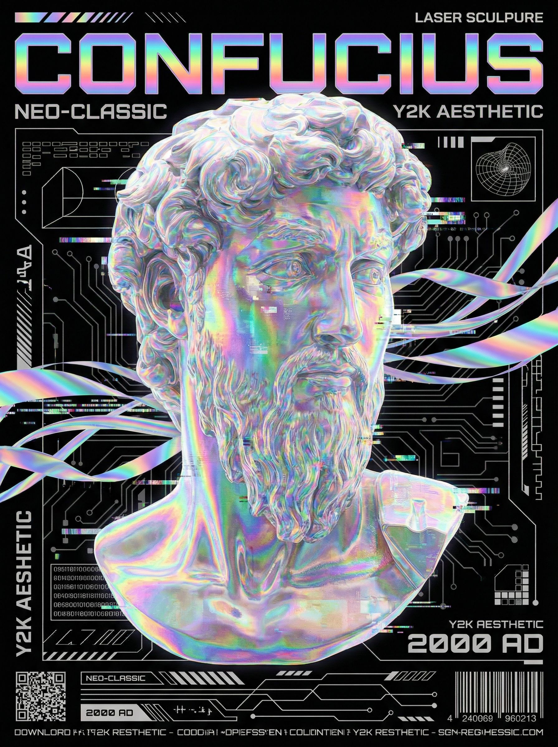
The community spotlight "Y2K Laser Sculpure" generates a half-body laser-style sculpture reminiscent of Michelangelo's David, but the subject is Confucius. The prompt specifies Y2K creative poster style, laser-style ribbons floating throughout, and a black background. This combination demonstrates three prompt strategies that transfer across AI creative workspaces:
Subject substitution with pose retention — Keeping the iconic contrapposto of David while swapping the figure creates immediate visual tension. For ecommerce, this maps to placing your product in a recognized compositional framework (hero pose, rule of thirds, golden spiral) while maintaining brand identity.
Style stacking — "Laser sculpture" + "Y2K" + "laser ribbons" + "black background" layers four distinct visual languages. Each modifier narrows the latent space. In practice, stack no more than three style tokens before testing; additional tokens often produce muddy results unless you use reference-guided editing to lock each layer.
Negative space as a design tool — The black background isn't empty; it isolates the laser ribbons and makes the sculpture's edges pop. For product shoots, a controlled background (solid, gradient, or subtle texture) reduces cleanup time in post and ensures consistent crop variants across placements.
Canvas Workflow: From Generation to Editable Layers
Vibart's canvas treats each generation as a layer stack. The workflow for this piece likely followed:
1. Base generation — Prompt the core sculpture on black. Generate 4–6 variants; pick the strongest anatomy and laser coherence. 2. Reference-guided refinement — Upload a David reference for pose, a Y2K moodboard for palette, and a laser ribbon reference for light behavior. Use the reference editor to blend these without collapsing the sculpture's form. 3. Layer separation — Duplicate the base. On one layer, mask and enhance ribbons. On another, adjust sculpture material (chrome vs. matte vs. iridescent). Keep typography on its own layer for later localization. 4. Crop variants — From the same canvas, export 1:1 (social), 9:16 (stories/reels), 4:5 (feed), and 16:9 (hero banner). Because layers are independent, you reposition ribbons and type per crop without re-generating.
This layer-first approach is what separates a creative workspace from a single-shot generator. You iterate on composition, not just prompts.
Visual Direction Lessons for Brand Assets
Contrast as hierarchy — The laser ribbons are the brightest element; the sculpture reads as form, not detail. Apply this to product hero images: make the product the form, let accent lighting (rim, glow, caustics) carry the brand color.
Cultural coding without cliché — Confucius is instantly recognizable; David's pose is canon. The mashup works because both are public-domain icons. For commercial work, swap in your brand mascot or founder portrait in a canonical pose (think: "Thinker" pose for a fintech founder, "Vitruvian Man" for a wellness brand). The reference editor lets you lock pose while changing identity.
Motion-ready statics — The floating ribbons imply motion. When you move to video generation (image-to-video or text-to-video), those ribbons become animation anchors. Prompt "subtle ribbon drift, slow camera push" on the same canvas layers to produce a 5-second loop for paid social.
Production Export Checklist
Before handing off to media buyers or CMS:
- Color profile — Export sRGB for web, Display P3 for high-end mobile placements. Vibart's export panel includes profile tagging.
- Naming convention —
brand_campaign_asset-type_crop_locale_v01(e.g.,vibart_y2k_hero_1x1_en_v01.png). - Layer archive — Save the
.vibartproject file. Future seasonal swaps (holiday ribbons, sale badges) take minutes, not hours. - Typography handoff — If type lives in canvas, export a transparent type layer + font spec (family, weight, tracking). Developers rebuild in code; designers keep the visual reference.
Scaling the Workflow Across a Campaign
One canvas becomes a system:
| Asset | Canvas Action | Time Saved vs. Re-prompting | |-------|---------------|------------------------------| | Hero banner (16:9) | Reposition layers, widen canvas | ~85% | | Instagram carousel (1:1 × 3) | Duplicate canvas, swap sculpture angle per slide | ~70% | | TikTok hook (9:16, 3s) | Animate ribbon layer, add text reveal | ~60% | | Email header (600px wide) | Crop, resize type, compress | ~90% | | Print poster (A2, 300 DPI) | Upscale base, sharpen edges, add bleed | ~50% |
The multiplier comes from reference-locked layers. Change the sculpture to a product, keep the ribbons and pose, and you have a new campaign in the same visual language.
When to Use This Workflow vs. Alternatives
If you need one perfect image and never plan variants, a single-shot generator with a detailed prompt is faster. If you need a family of assets across crops, channels, and seasons — especially with brand consistency requirements — a canvas workspace with reference editing and layer management pays off after the second variant.
Teams evaluating Lovart alternative AI design canvas options should test: can I isolate the ribbon glow on its own layer? Can I swap the subject via reference without re-rolling the background? Can I export crop variants from one project file? The answers determine whether the tool fits a production pipeline or stays a concepting toy.
Next Steps for Your Team
1. Pick a canonical pose relevant to your brand (thinker, victor, explorer, creator). 2. Build a 3-image reference pack: pose, style palette, light behavior. 3. Generate 8 base variants on black. Select 2. 4. Split into layers: subject, accent lighting, background, type. 5. Produce 5 crop variants from each. Archive the project.
You now have a reusable visual system, not just a gallery of images.
Sources and further reading
The workflow and platform rules in this article are grounded in these primary references. Confirm current rules for your market and channel before publishing.
- Vibart community work: Y2K Laser SculpureVibart community · 2026-01-13
Next step: make one asset with the same workflow
Do not stop at the comparison page. Upload a reference, generate a direction, then keep copy and brand elements editable on the canvas.